
No matter if you are making a poster for a school project, a particular event, an advertisement, or something else, it needs to look professional and get the message across clearly. Unfortunately, there are some common mistakes people make when it comes to the design process. This post will discuss some of the most common mistakes to avoid along the way.
Unoriginality
One of the most widespread mistakes many people make when designing posters is using generic images, stock photos, and ready-designed and filled templates that have been employed countless times before. Instead, it is better to find original pictures that are related to your topic. It will make sure that your poster design stands out, gets people’s attention, and brings the right message across. Furthermore, when you make a poster, consider resorting to resources like StoryboardThat, which contains unusual design options that are especially helpful for teachers, or find something similar, depending on the occasion you are preparing your creation for. Also, if you do decide to use stock photos, customize them with other unique elements, so they do not look too generic or overused.
Poor Readability
One of the main things people notice when they look at a poster is its readability. If your typeface is too small, the font is too fancy, or there is too much text on the whole composition, it can be difficult to read. Moreover, it may even put people off from reading and understanding the main message you aimed to convey.
To avoid this mistake, use fonts that are big enough to be legible and easy to read—but no more than two to three fonts per page! Make sure the fonts work well with the rest of the design to maintain the balance of your creation. It means they blend well with other composition elements, including:
- images;
- graphics;
- lines;
- shapes;
- framings, and so on.
Also, make sure to leave enough space between the letters and choose the right colors for your text message. They can help draw extra attention to the crucial elements of your poster.
Cluttered Layout
A cluttered layout will not only make it hard for viewers to process all of the information on your poster but also detract from its overall aesthetic appeal. Therefore, when designing your poster, try to leave plenty of white space between all the components. Also, refrain from cramming too much information onto one page—keep the overall design simple!
When it comes to adding images, pictures, diagrams, schemes, or any other heavy or vivid graphic elements, the general rule remains similar—use them sparingly. The key point is to apply one or two of the most powerful visuals. Most of the time, it is more than enough. Also, they can have a more significant effect than a lot of smaller ones spread out all over your creation.
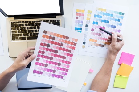
Poor Color Choices
Colors affect how people feel and make them react differently, so it is essential to choose them carefully. Use the rules of color theory, learn how to use the color wheel, and look into some fundamental aspects of color psychology when choosing colors for your design. It will help your poster have the most impact possible. Now let’s look at some of the most popular colors and their meanings.
- Blue communicates trustworthiness, responsibility, and intelligence.
- Red is associated with energy, passion, love, and excitement.
- Black color helps convey power, elegance, and sophistication.
- Gray is associated with professionalism and formality; it can leave a sense of lacking emotions, but at the same time, it can represent dependability and politeness.
As with fonts for your text, keeping harmony in the color scheme ensures the colors work in synergy with other composition elements. Contrasting colors can add life to the whole design and draw viewers’ attention to the crucial message. However, sticking to balance remains essential as mismatched colors or an abundance of too vivid colors can create visual chaos and prevent viewers from perceiving your creation’s main idea.
Drawing a Conclusion
Planning and thinking about making a good poster is important if you want it to stand out and get its main message across without being too overwhelming or hard to read. By avoiding these common mistakes—poor readability, unoriginality, inappropriate color choices, and a cluttered layout—you can create an eye-catching creation. Keep all the suggestions above in mind to be well-equipped with everything you need for a successful poster design!


